
Research
Creative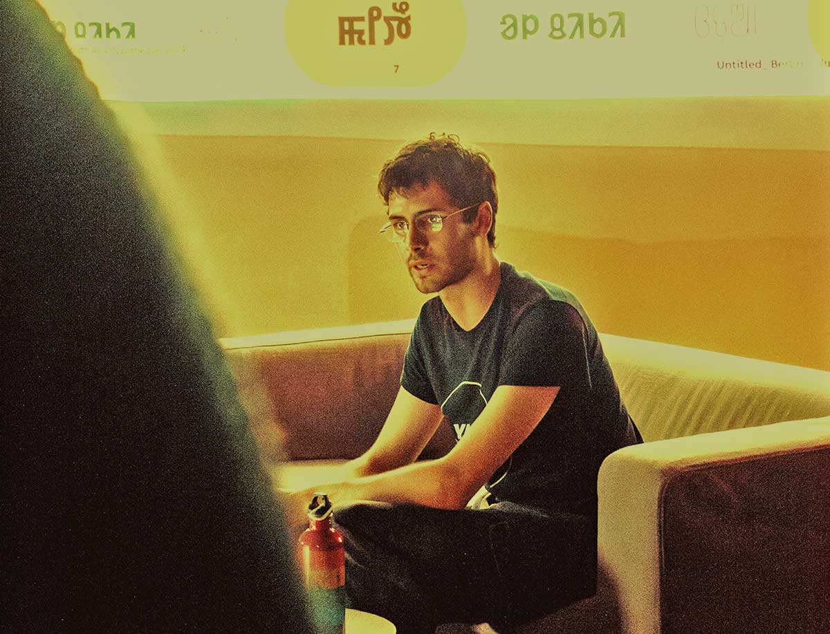
Interview for type.today
‘Designers thinking that accessible things are ugly is a problem’
In a conversation with type.today's Adelina Shaydullina, we discussed why a type foundry would want a cognitive psychologist on staff, covering most of my recent work along the way. Much of it is about working alongside type designers rather than around them: what they want from research, and how often a design question turns out to be one nobody has actually tested. Designers know their craft very well, but at times, further evidence is needed to guide their practice.
You can read the full interview on type.today's website, where we also get into where I think type research is heading, particularly beyond Latin, and how I hope we're studying how we read in ten years time.
Article
type.today journal

Accessibility Tools
Building a hub of resources with tools and documentation
Is there a specific font that helps people with dyslexia? Is my design accessible at all? What does accessibility mean? Designers frequently have well-intentioned questions about accessibility, but the answers are often locked behind dense, convoluted academic literature. To bridge this gap, we built accessibility.tools, a free, research-backed platform designed to turn complex cognitive science into practical, accessible and actionable knowledge.
Serving as the project lead and lead developer, I coordinated a team of researchers and editors to develop the first version of the site, released to celebrate Accessibility Awareness Day 2026. To ground the platform in real user needs, we initiated the project with a comprehensive survey that gathered over 200 responses from the design community. We then continually conducted usability testing directly with working designers, collaborating with a Human-Computer Interaction researcher to refine the user experience.
The resulting platform features two main pillars: thorough, editorially independent documentation (launching with 40 short-form articles on dyslexia compiling over a hundred academic sources), and a suite of browser-based testing tools that link back to the documentation. Released under an open license (CC BY-SA 4.0), the platform serves as an evolving reference for inclusive design.
This is the first iteration of the site, with expansions and improvements coming soon. The project was presented at ATypI Stanford 2026.
Article
Typotheque

What font users actually want
Fonstand User Survey 2025
To understand user preferences and frustrations with fonts, Fontstand, a font streaming service, conducted a survey with over 1300 participants. Designers, art directors, developers, and educators shared their impressions on font usage, providing insightful data on real-world practices.
I developed, analyzed, and visualized the survey results. Working closely with the Fontstand team, we created a detailed questionnaire capturing both quantitative preferences and qualitative feedback. I performed thematic analysis on open-ended responses to understand the nuances of user frustration. The findings revealed a significant barrier: licensing complexity. Nearly three-quarters of respondents struggle with unclear usage rights, and two-thirds have avoided purchases specifically because of confusing terms.
The analysis resulted in a comprehensive 53-page report with detailed infographics on user behaviors, needs, and preferences. These results informed the upcoming licensing model of Fontstand, that will become their new standard in 2026. You can view the full results on Fontstand's site or read the press release.
Article
Fontstand News
PseudoText Generator
Stimuli that's comparable across writing systems
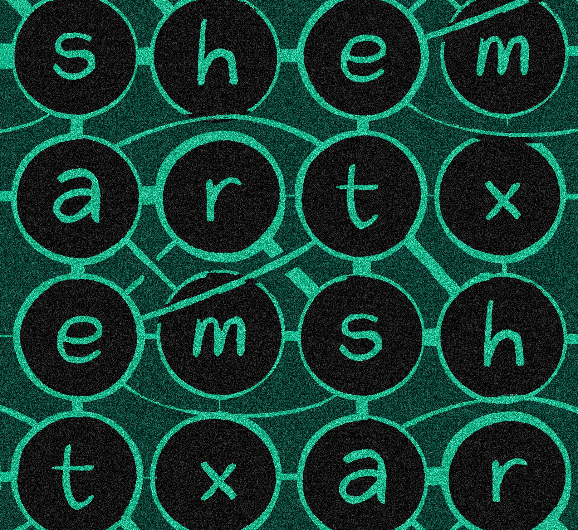
In this short article, I describe the process of a new tool developed for my practice at Typotheque. How do you generate text stimuli with no semantic meaning that remains comparable across multiple writing systems?
Traditionally, designers and researchers rely on placeholders like Lorem Ipsum, but those fall apart when you need to compare languages. Psycholinguists have developed tools that generate high quality stimuli, but limited to Latin, and only sometimes with other scripts, like Greek or Cyrillic.
The PseudoText Generator creates meaningless but structurally consistent text across Hindi, Thai, Tamil, Urdu and of course Latin. This ensures that when testing a hypothesis, the stimuli can remain consistent across scripts, keeping semantic interference to a minimum. Read more on this article, and try out the tool today!
Article
Inter-cultural measurements of font weight
What's bold for me is bold for you?
Although typographical weight might be treated as a universal variable, a look at different scripts and their typesetting preferences reveals that the perceptions and preferences might may actually be culturally-dependent. For example, readers of a script with more complex shapes will likely prefer text set lighter than the average Latin reader, just because of the darkness caused by these more convoluted shapes colliding.
In this talk we propose a standardized method to test weight perception across cultures and writing systems, establishing a shared experimental framework to measure how readers from different cultural backgrounds perceive typographic weight. Weight is measured objectively through pixel darkness, while perception is captured through single-blind subjective ratings. The experimental design and engineering were developed in-house, together with Rafał Buchner.
The project is currently in its sampling phase, still open to responses. Early results point to agreement within cultural groups and systematic differences between them. Thai is the first non-Latin script under investigation, with further scripts planned. The project contributes to perception research while directly informing type design practice. If weight perception varies across cultures, then regular weight cannot be treated as universal. Instead, it becomes a parameter that must adapt to readers in multi-script typographic systems.
Talk
Typography Theory Practice
El letrero de Año Nuevo en la Puerta del Sol
An article about Spanish New Years, typography and invasive marketing
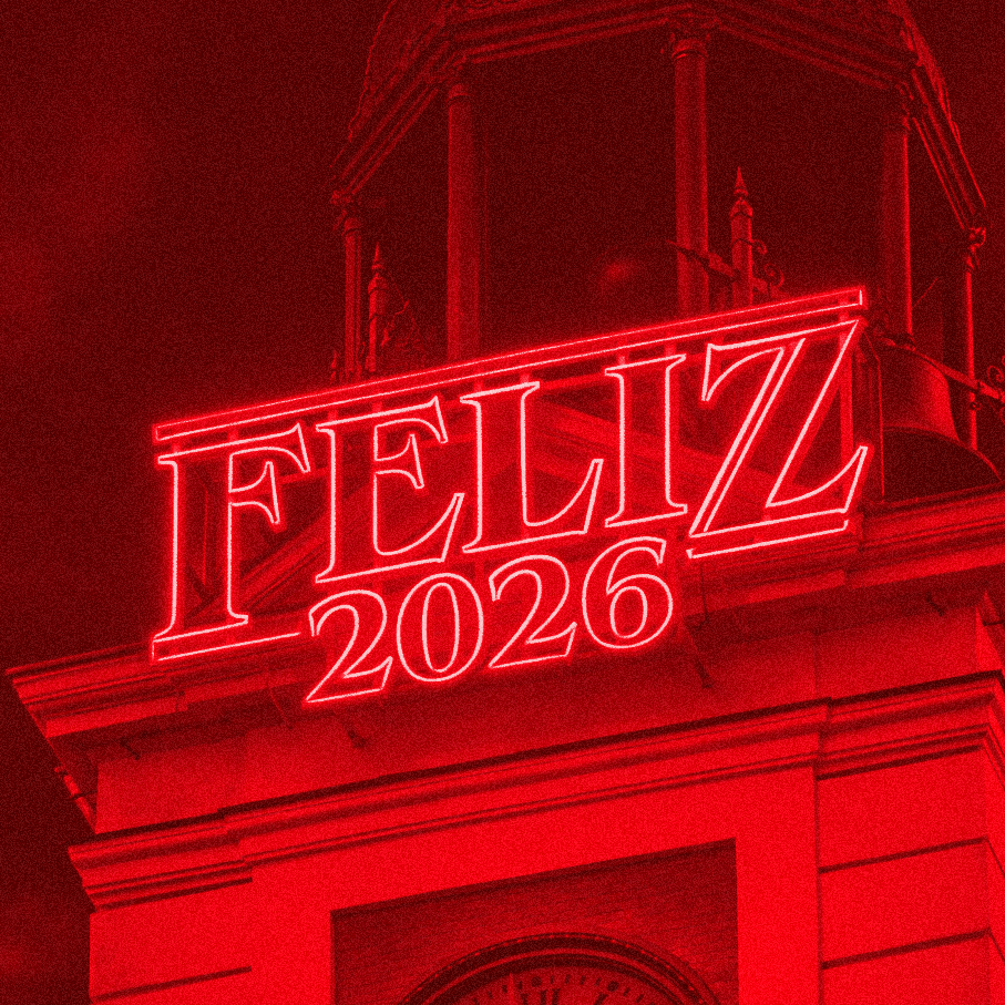
I wrote a short piece for Gràffica on how Netflix subtly pushed a very intrusive marketing campaign this New Year’s Eve in Spain. Traditionally, Spanish people start the year watching Puerta del Sol, in Madrid, for the countdown.
In previous years, companies have rented the building’s façade for projections, but this year's campaign went a step further and changed a sign that's never been rented, one right in front of the clock. This change made the promotional asset hard to avoid for any TV network broadcasting from the square, effectively appearing everywhere.
In the article, written in Spanish, I look at the consequences of that shift, as well as the history of the typeface, its links to 80s aesthetics, and how its everyday associations in Spain can shift the meaning in unexpected ways. Thank you to Víctor Palau at Gràffica for his help publishing this article.
Article
Gràffica
The Effects of Thai Loops
Studying the implications of this feature of the Thai script
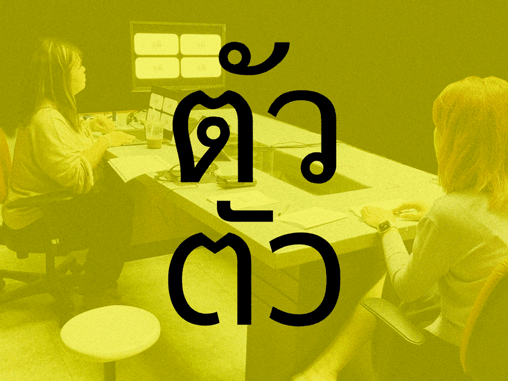
As we expanded our font catalogue to include Thai, we needed to move beyond assumptions and examine whether loops influence how people read. These loops, or embellishments at the ends of letters, can be seen as structurally analogue to Latin serifs, but their connotations and impact on reading are fundamentally different.
Three experiments were designed to test the effects of loops at different levels: decoding (using a visual acuity paradigm), continuous reading (with an eye-tracking study) and perception (through a survey of reader opinions). To achieve this, we developed custom fonts where loops in which loops were the only variable. The tests were conducted with native Thai readers across different age groups at Chulalongkorn University, in Bangkok.
The results were clear: looped fonts consistently supported faster and more accurate reading, with this effect being especially strong among older readers. Loopless, despite its modern appeal, proved less effective in extended reading contexts. The survey also offered clear evidence of reader attitudes, linking loops to qualities such as tradition and seriousness.
Overall, the study makes a strong case for respecting script-specific features in type design. Rather than simplifying forms to mirror Latin trends, this evidence shows that Thai readers benefit from the distinctive (and more complex) structures of looped text. These insights directly informed Typotheque’s new Thai collection, presented alongside this research at the BITS conference in Bangkok in January 2025.
Article
Typotheque
Almen Sans
Contemporary connotations of typographic features
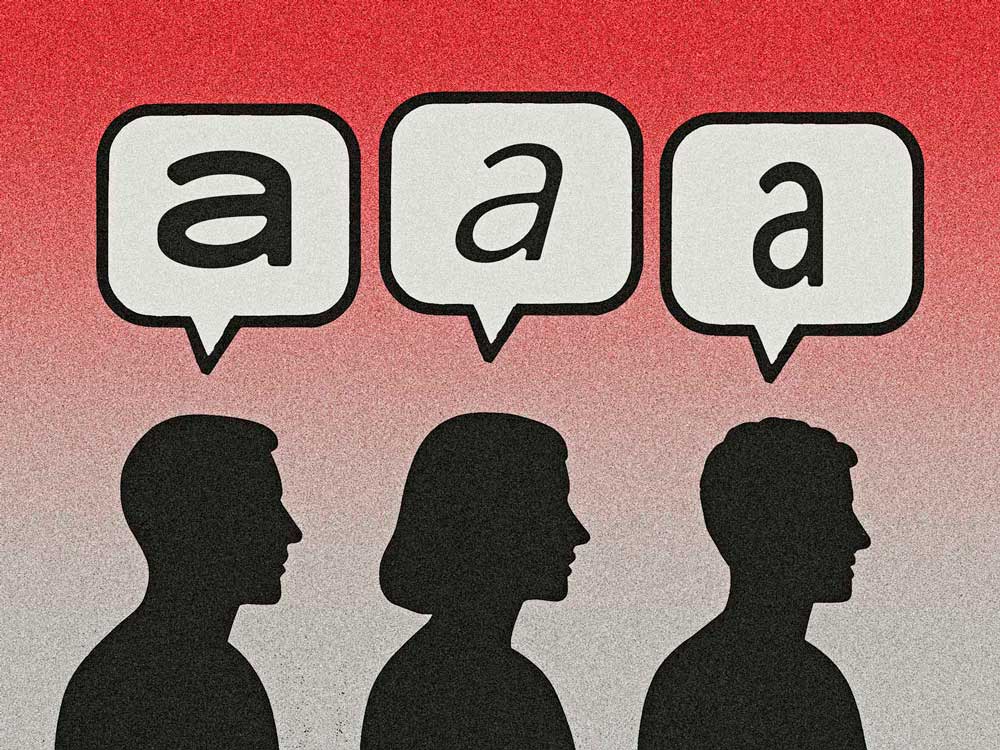
We set out to move beyond questions of legibility, and instead examined the effects of type on conveyed personality. With guidance from Sofie Beier, and with the input from designer Elias Stenalt Werner, who designed the type for this, I investigated how specific typographic parameters influence the tone we perceive in written text, as part of a longer project being carried out at the Centre for Visibility Design.
We worked with a baseline sans-serif design developed for this study, and from there introduced controlled variations in slant, width, curvature, and x-height. These adjustments created a set of fonts where only one feature shifted at a time, allowing us to isolate its effect on perception.
The experiment was conducted with more than 200 participants, each comparing pairs of texts and judging how well they matched short personality-based statements. These were based on seriousness, agreeableness, and anxiousness markers from well-stablished human personality research. This happened in a blind setting, with participants unaware of the intentions of the reserach.
With this method, we measured how people intuitively map typeface shapes onto emotional qualities. The results showed consistent patterns: slanted and condensed type were seen as less serious and less agreeable. Wider forms, by contrast, shifted perception toward openness but sometimes also unease. These findings, part of a larger research project, were discussed during a panel in the Association Typoraphic International (ATypI) Conference 2025, in Copenhagen.
Other projects discussed on this talk include line-by-line text magnification for small screens and gaze-contingent word highlighting for beginner readers, all ongoing projects at the Centre for Visibility Design at the time.
Talk
ATypI Copenhagen
Designing fonts with low-vision readers in mind
A scientific experiment for Typotheque's latest font
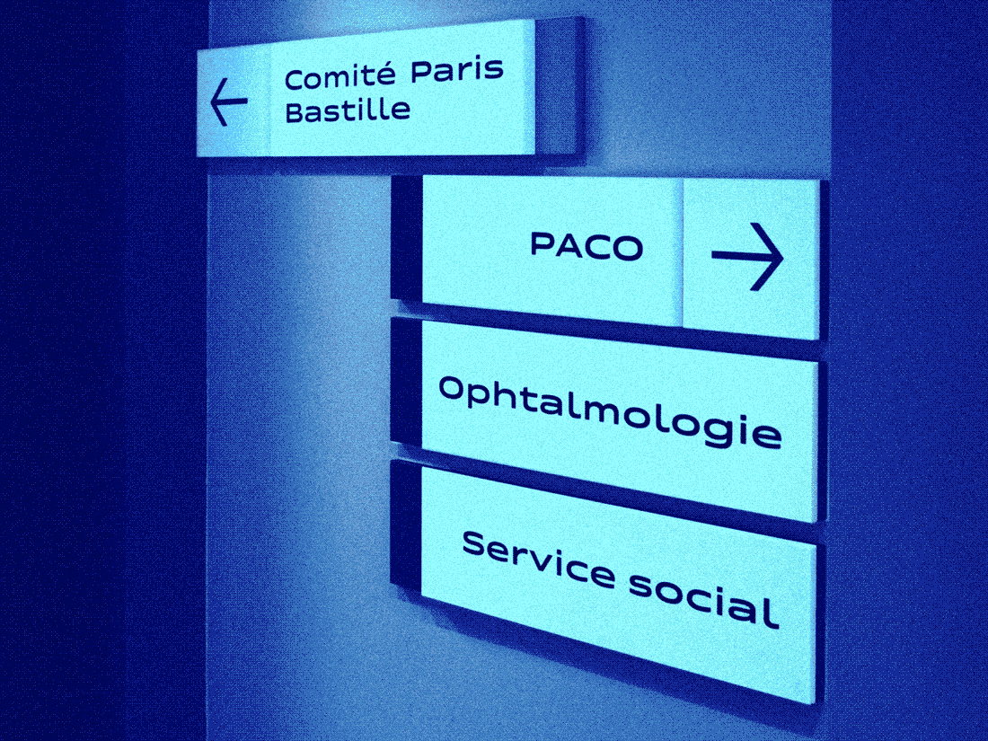
This study examined how typeface design can support readers with low vision, focusing on distance reading for a wayfinding system. A custom version of a new typeface was developed, varying letter width. An experiment with visually impaired participants at the Paris 15–20 National Ophthalmology Hospital measured reading acuity across these variations. Results showed that subtle adjustments in character width improved legibility, leading to the implementation of the adapted typeface in the hospital’s signage system.
Additionally, you can access another piece about the research on Typotheque's website. This version describes full methods and analysis, but is not peer reviewed.
Scientific paper
Information Design Journal
Enhancing Distance Reading for Low Vision
A talk on Typotheque's research process
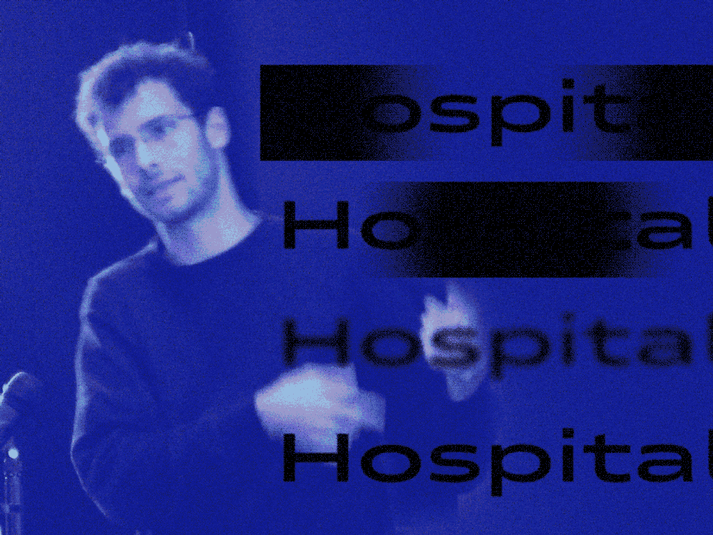
As part of the distance reading research we did for Zed and the 15-20 Hospital in Paris, we prepared this talk to describe the project at the Typography Theory Practice conference in Leeds, ino October of 2024. You can watch the full talk on YouTube, describing the methodology and results for a crowd of designers, type designers and educators.
Talk
Typography Theory Practice
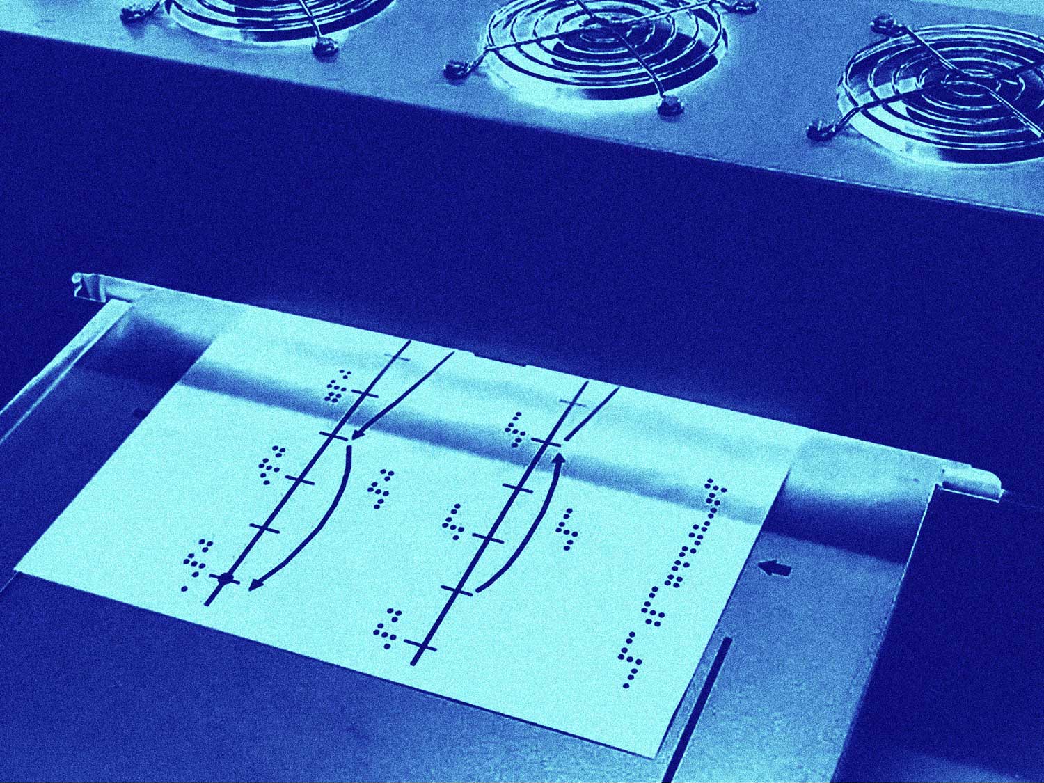
Optimising Braille Character Spacing for Enhanced Tactile Reading
The project investigated optimal Braille character spacing to improve tactile legibility across diverse reader groups. Current standards vary internationally, with dot spacing ranging from 2.3 to 3.0 mm, but little data supports these norms. Working with ONCE in Madrid and the County Blind Association of Split, this piece describes a small survey we conducted to evaluated embossed samples with dot intervals between 2.5 mm and 3.25 mm.
Results showed that increasing spacing up to 2.75 mm improved readability, especially for older readers or those with reduced fingertip sensitivity, while larger distances impaired contextual reading. Based on these, two variants of Zed Braille were developed: a standard 2.5 mm version and an alternative 2.75 mm version for enhanced legibility. Both are distributed freely as part of the Zed type system.
Article
Typotheque
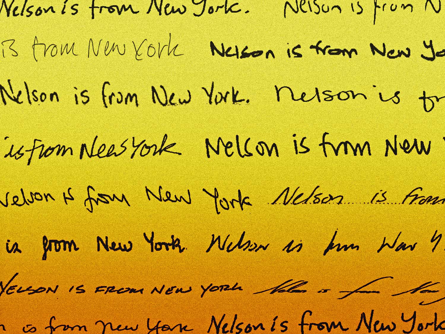
Typotheque's Handwriting Database
566 samples of contemporary Latin writing
To better understand the diversity of Latin-script handwriting and in support of handwriting-style release 'Dash', Typotheque created the Handwriting Database, a large open repository of contemporary handwriting specimens.
Data was collected through an online copy-book form adapted to 20 languages, which prompted participants to provide samples of minuscule, majuscule, initials, and numerals. In total, 596 samples were gathered from 46 countries, representing speakers of 29 languages.
Alongside collection, participants completed a perception survey comparing familiar and unfamiliar letterforms. You can read more about that piece of research in the article 'Familiarity effect in the perception of handwriting', available in this list.
Article
Typotheque
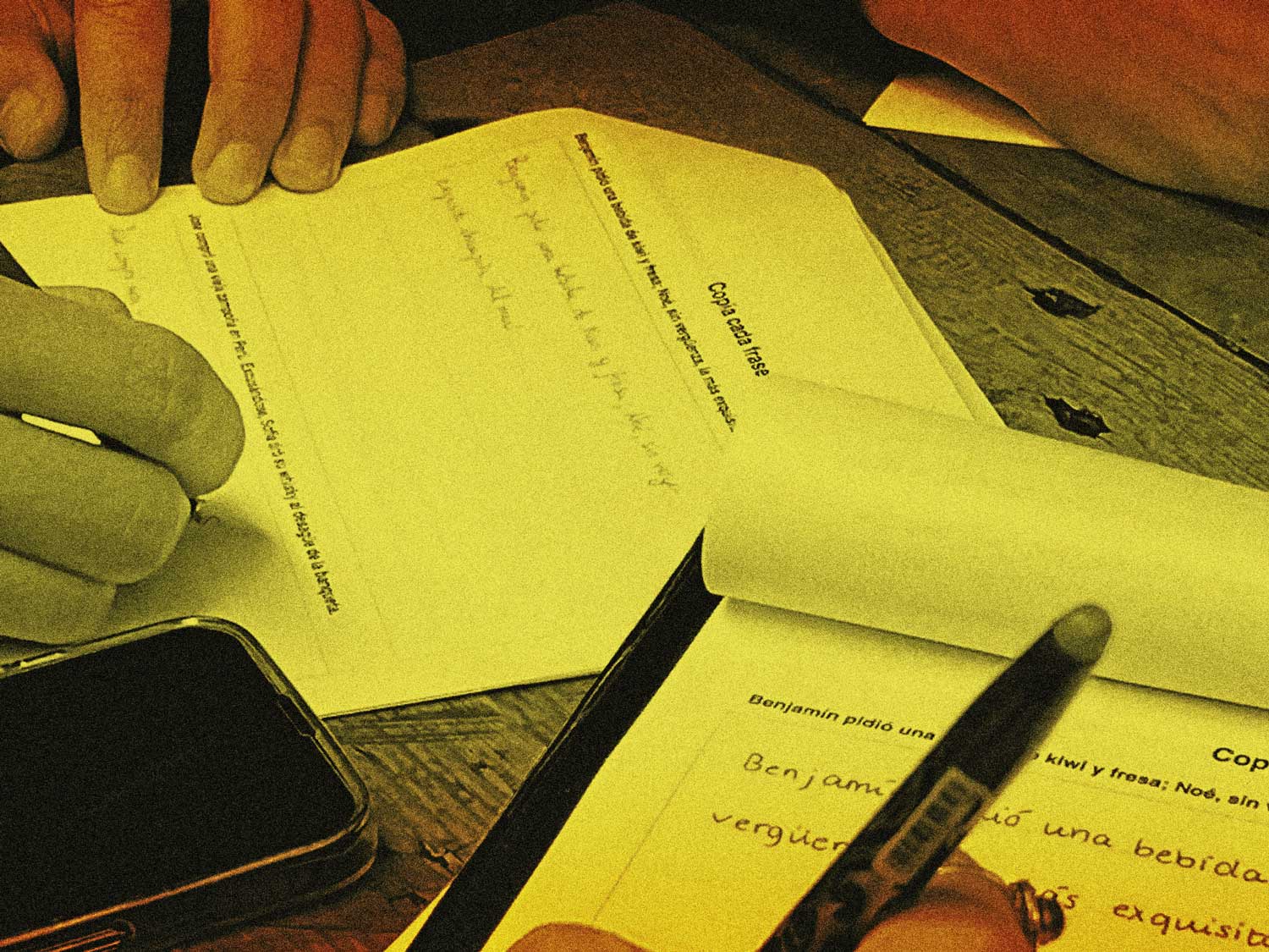
Familiarity effect in the perception of handwriting
Evaluating in-group/out-group effect among readers of the Latin script
There is much evidence that familiarity can affect perception of stimuli, with items that are familiar to the individual being preferred and better remembered. Previous research has also shown that familiarity with a typeface increases preference for it, but no studies have evaluated the impact of familiarity in relation to the affect towards handwritten text.
For the present study, a two-part experiment (N = 422) was designed to measure how contemporary users of the Latin script perceive handwritten text. The first section was designed to collect specimens of the participants’ handwriting. The second, which was adapted to each participant’s handwriting style, measured implicit judgments of certain familiar letter shapes against unfamiliar ones.
Results show that familiarity positively influences the extent to which one judges the friendliness and trustworthiness of handwritten text. Furthermore, the greater the similarity to how one writes a letterform, the greater the observed effect in terms of perceived friendliness. These findings suggest that people have an implicit bias towards handwriting that looks like their own.
Scientific paper
Journal of Writing Research
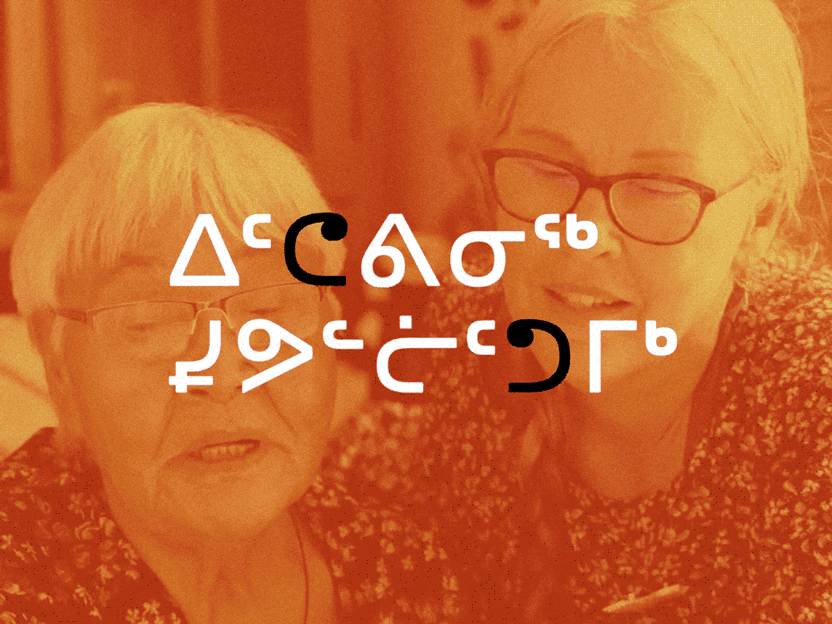
Localized Typefaces for North American Indigenous Languages
To support the digital preservation of Indigenous languages, Typotheque undertook a comprehensive research project in collaboration with Indigenous communities in Canada and the United States. The project, directed by Kevin King, began with community outreach to understand local Indigenous needs and the technical barriers they faced with digital text.
Research identified that communities like the Nattilik were missing essential characters from the Unicode Standard, preventing them from accurately writing their language digitally. In response, Typotheque worked with language keepers to prepare and submit two successful proposals to Unicode, a process that took two years, to add the missing characters and correct representative glyphs.
This talk discusses the early phases of this process, and introduces the type of community-centered surveys Typotheque develops to understand the preference of users.
Talk
TypeLab at Typographics
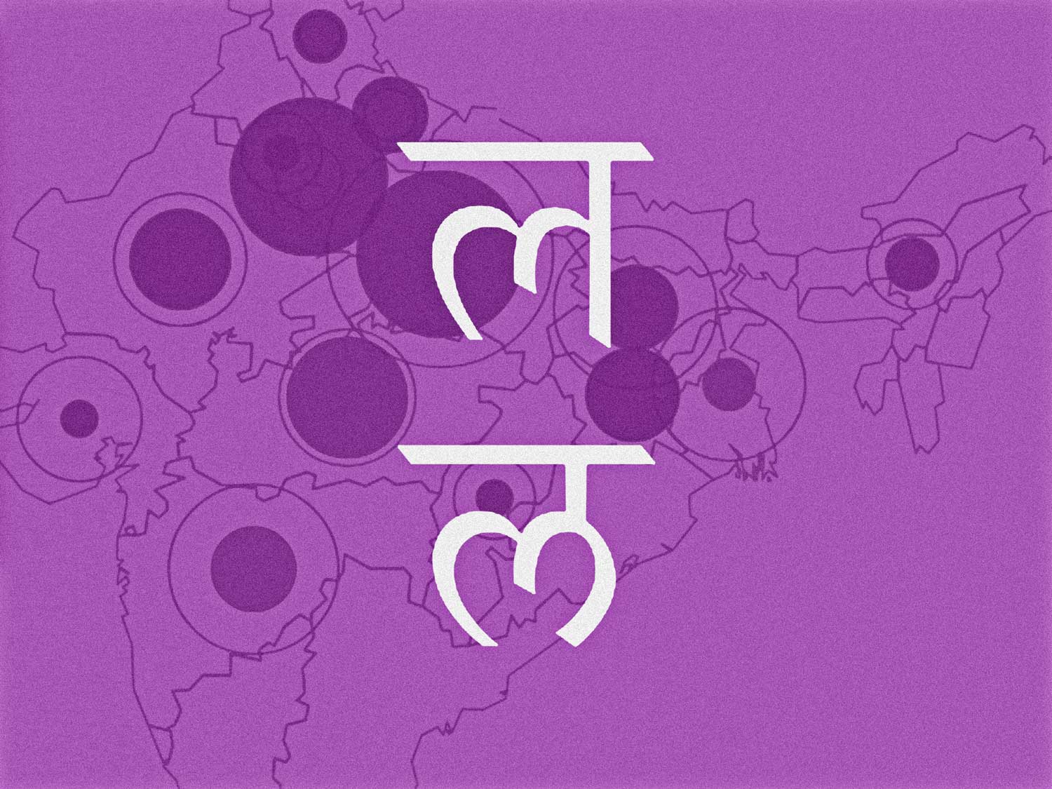
Regional forms of Devanagari
Understanding user preference
To map the diverse typographic preferences of the Devanagari script, which is used by over 600 million people, Typotheque conducted a large-scale online survey with over 400 respondents. This research was driven by the need to understand regional variations in the script and to create a more inclusive and authentic reading experience.
A survey was designed to collect explicit data from native Devanagari readers. Participants were asked to provide their demographic information and then presented with a series of glyphs, prompted to show preference, recognition and education. The survey was promoted through social media, design communities and with sampling on local libraries, reaching a wide audience across the regions of interest.
The results revealed significant regional preferences for certain letterforms. For example, some forms were more popular in the northern regions of India, while others were preferred in the southern regions. These findings challenge the idea of a single Devanagari script and highlight the importance of designing typefaces that cater to local preferences. The survey data also showed that age also should influence typographic choices.
The insights gained from this survey directly informed the design of Typotheque's Devanagari typefaces. By incorporating regional variations and preferences, the foundry was able to create fonts that are not only aesthetically pleasing but also culturally sensitive and more legible for a wider range of readers. The findings also serve as a valuable resource for other type designers working with the Devanagari script.
Article
Typotheque
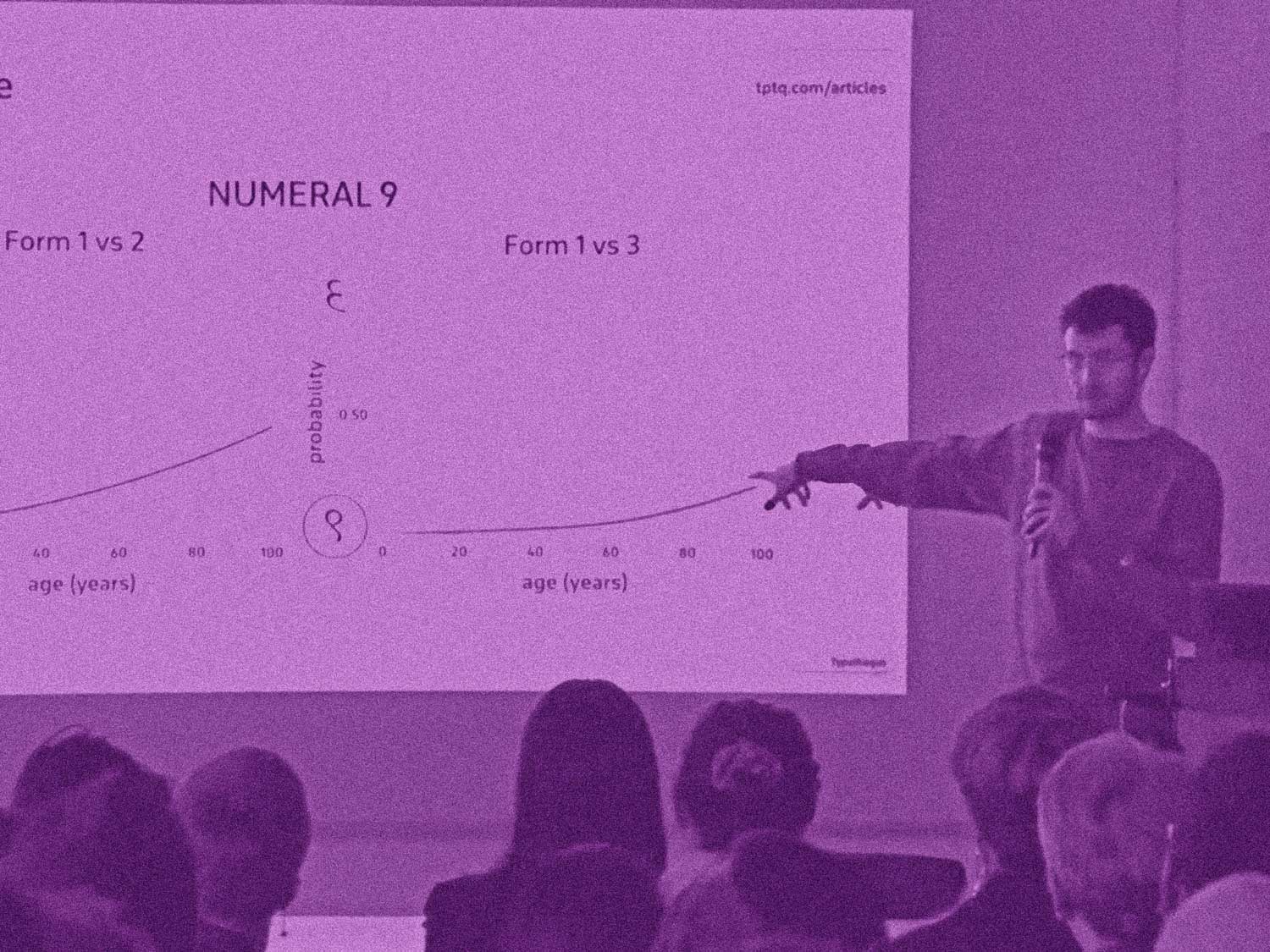
Designing fonts for 2 billion people
Research and development of a collection of fonts for South Asia
This talk presents the findings of a large-scale survey mapping the regional typographic preferences of the Devanagari script, presented during ATypI 2023 in Paris. An online study was conducted with hundreds of native readers to identify local variations in letterform choices. The results demonstrate clear and consistent regional preferences, challenging the notion of a single standard for Devanagari and highlighting the need for culturally nuanced type choices for this script.
You can watch the full talk, which details our methodology and findings for an audience of designers, researchers, and students. For a deeper dive into the data, the complete survey report is available to read on Typotheque's website.
Talk
ATypI Paris

Improving paragraph reading
The effect of beginning-of-line additions in readability, an eye tracking experiment
This project, which served as the thesis of my masters on Applied Cognitive Psychology, investigated whether adding elements at the beginning of lines of text could improve paragraph readability.
Using an eye-tracking experiment with 20 participants, four conditions were tested: repeated words placed outside or embedded within the text block, graphic additions (diamond symbols before each line), and a control with no modifications. Results showed that word repetition hindered performance, increasing fixation counts and reading time.
By contrast, the graphic additions condition significantly reduced reading time, regressions, and fixations compared to other conditions. These findings suggest that simple visual markers can support more efficient return sweeps during reading, while textual repetition adds cognitive load.
The study provides new evidence that non-textual cues, when integrated into layouts, may enhance navigation within paragraphs.
Scientific paper
University of Utrecht
Perceived Personality
Can font features predict conveyed character?
This study explored how specific anatomical features of fonts influence their perceived personality, using the OCEAN model as a framework.
Across three experiments, 183 participants evaluated both existing and artificially generated typefaces. Results showed consistent effects: boldness increased perceived extraversion, slant reduced conscientiousness, while stroke uniformity and rigidness lowered openness and agreeableness. Serif presence and character width showed little impact on personality perception.
A third experiment tested whether people prefer typefaces that match their own personality traits, revealing weak but suggestive tendencies. Overall, the findings support the idea that typeface features shape personality perception in predictable ways, challenging the usefulness of traditional serif/sans classifications.
The full manuscript is available only upon request via email.
Article
University of Manchester
Join the newsletter and get an email when there's a new project