Concept and first exploration
Eric invited me to work developing visuals for his music in early 2022. His music is heavily inspired in the 70s and 80s, with musical references like Parcels and Jungle.
During the first months of this collaboration, we looked for visual references. One that really lingered was a sign, which I initially thought was hand-painted, in Puerto de la Cruz, in Tenerife. The sign belonged to a beloved café in the city, which serves sandwiches, cake and coffee to tourists and locals alike.
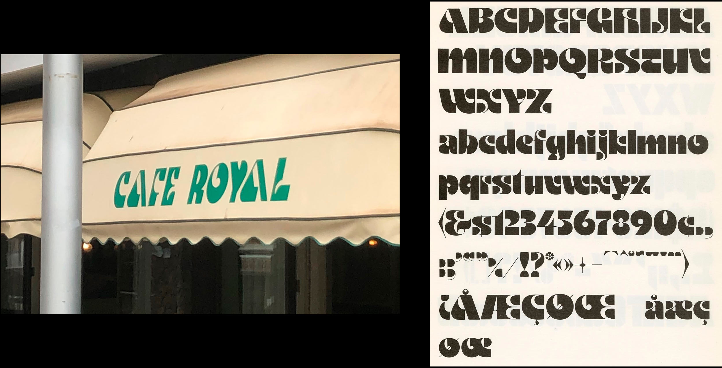
After some digging, I learnt that this sign was actually not hand painted at all, and instead took letters from one of the drawings of Othmar Motter, an Austrian (very appropriate for Puerto de la Cruz) that drew this alphabet in the 1970s (also very appropriate, for this project but also regarding the bloom of tourism in this area of the island).
These letters served as a reference for the first visuals we developed. These were mainly purposed for live performance, for which I built a few simple looped animations that could be played alongside his shows.
Custom Type
But Eric was working on an album, which needed more than one lettering. I immediately considered this an opportunity to spend time drawing more letters, improve in the process and also learn more about the tools that my peer type designers use.
Luckily, Eric fully supported this idea, so I started to look for more references that could guide me. Motter Ombra was too ornate, and felt unauthentic to Eric's Spanish (and Canarian) identity. We had to find something with more presence in the local typographic landscape.
Browsing through my very hidden archive of letter finds, I found a recurring reference with good potential in an unexpected place: The wayfinding of old buildings.
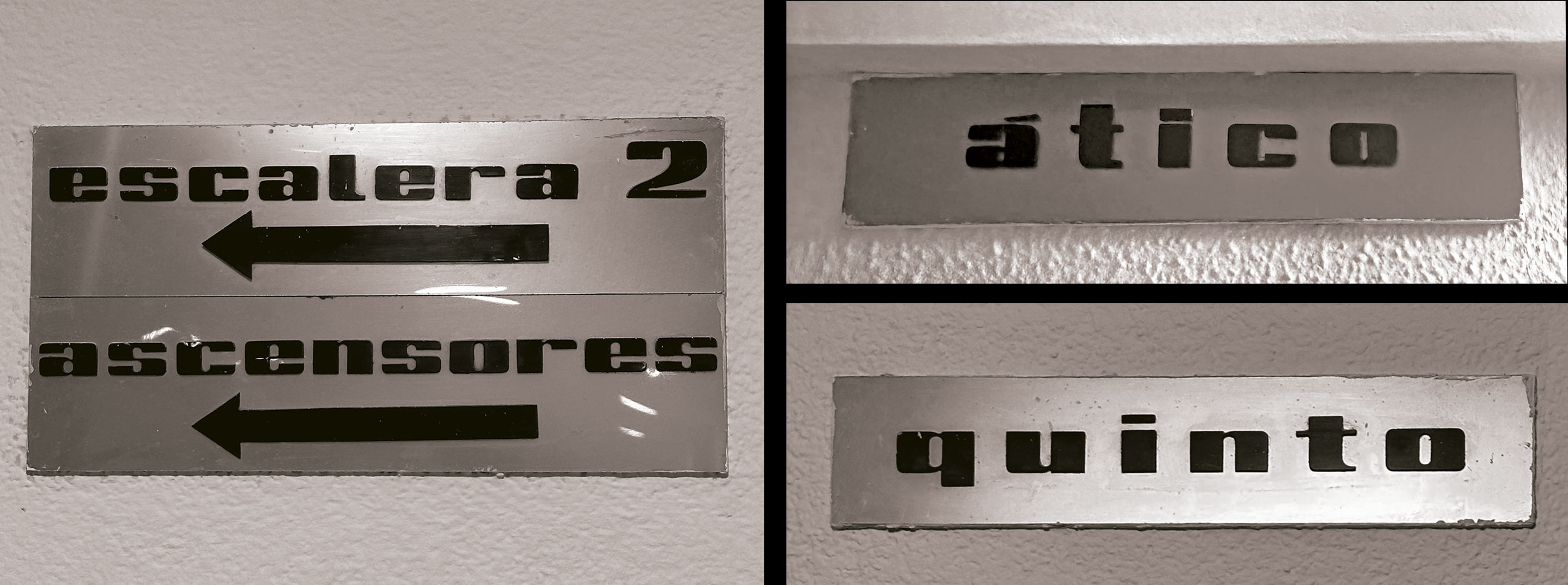
These letters are often found in un-renovated buildings from the 80s, and I've only been able to find them in Spain. They are usually near elevators and stairs, and tend to indicate the house number or current floor. The letters are normally individually set on an shiny silver-like plate, in black, and seem to be produced in some plastic that's pasted directly to the plate.
Although I've accumulated many pictures of these, I've yet to identify their exact origin. If you have any clue of where they originate from, please drop me a line!
Taking these as a reference, I started to draw. The proportion felt incredibly squished, so I decided to vertically distort the letters whilst keeping their features.
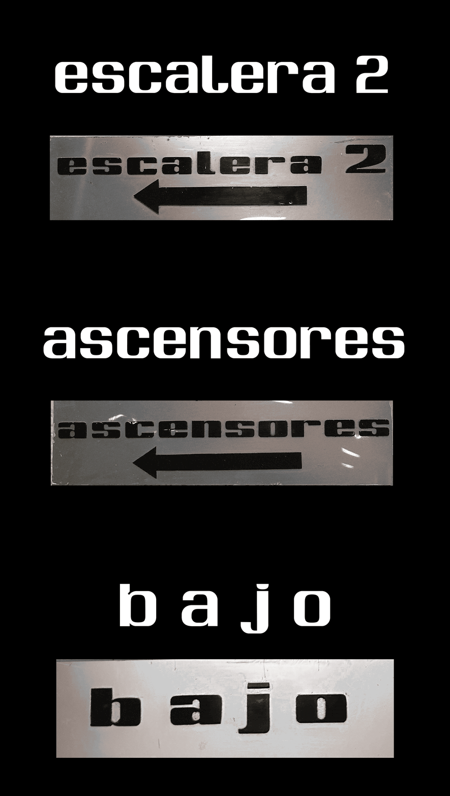
The result is a very boxy display font with tall x‑height and veeeery small ascenders and descenders. Although the font is still very rough (specially in terms of spacing), I had a lot of fun drawing the Spanish glyph set with numbers.
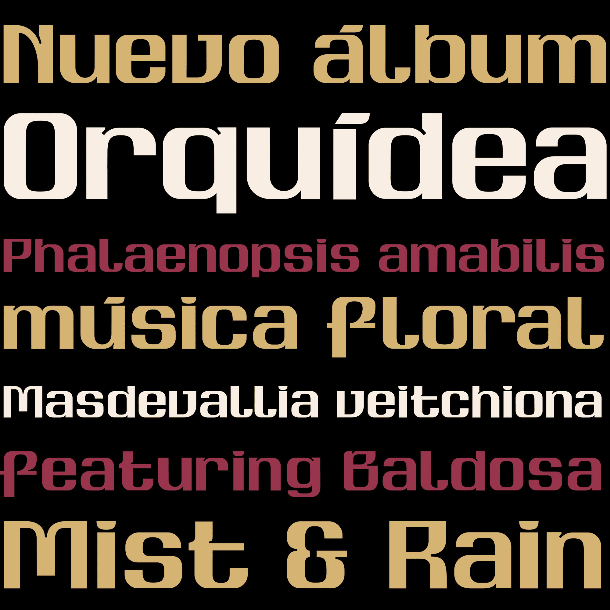
Developing these typefaces came with a steep learning curve. I got some great help from Cem Eskenazi, Cecilia del Castillo, and Berta Tetuà, who patiently reveiwed my drawings and helped refine the details. A big thank you to these three great professionals for their invaluable feedback <3
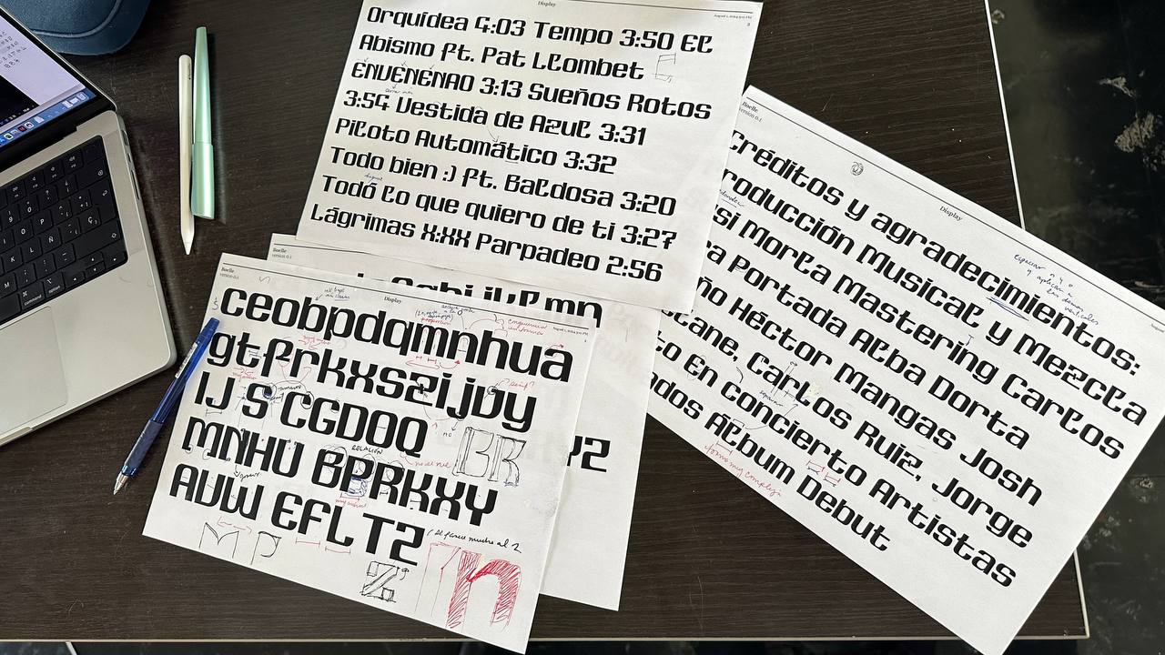
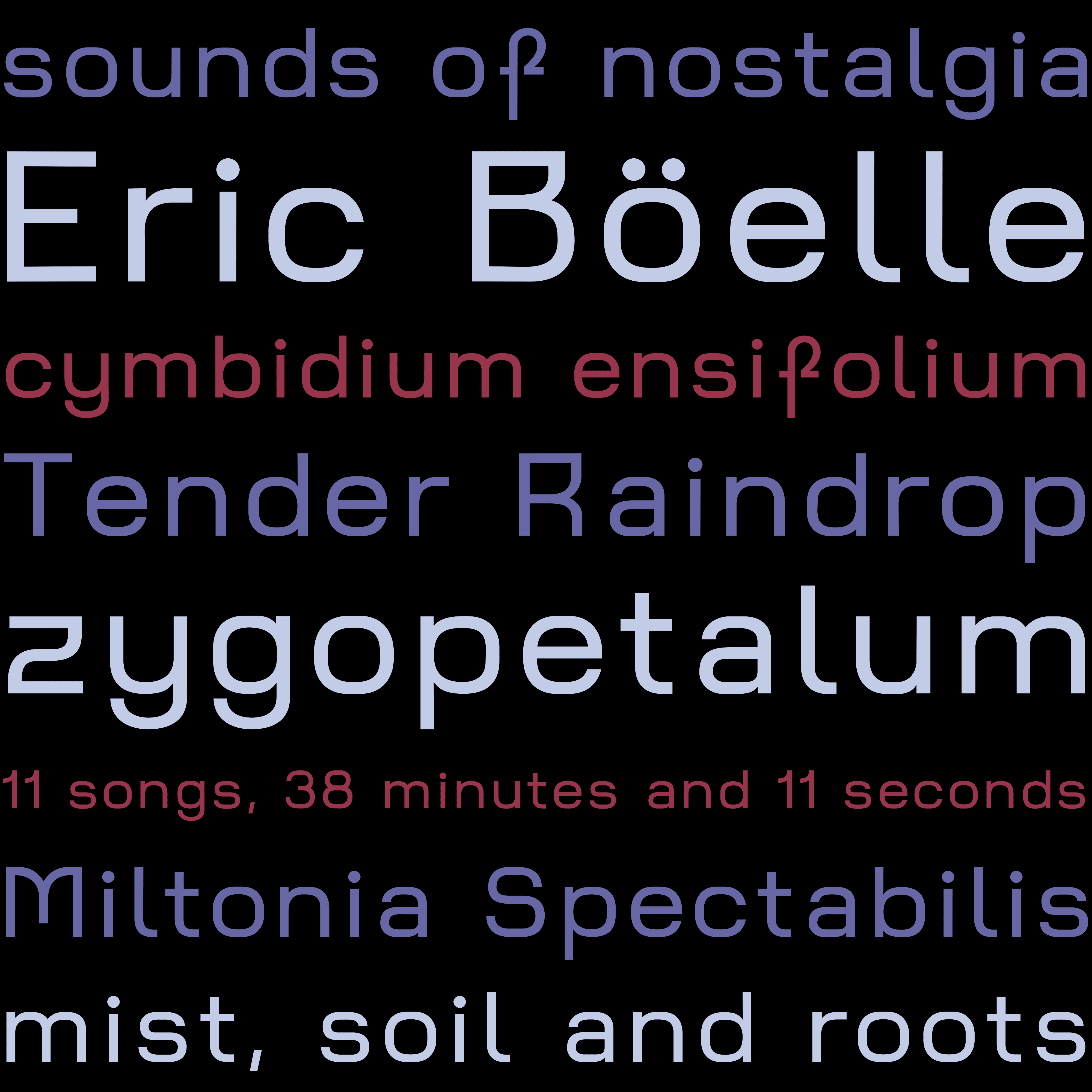
Whilst at it, I soon realised that one very heavy typeface would be insufficient. We needed a lighter and more legible font for smaller size.
Inspired by Eurostile and the design of the display font in development, I drew (and passed through my wonderful reviewers) a 'Text' version that was lighter and had more spacing.
Vinyl design
Eric wanted a physical edition of the record, so we delved into it as soon as we had some working prototype of the fonts.
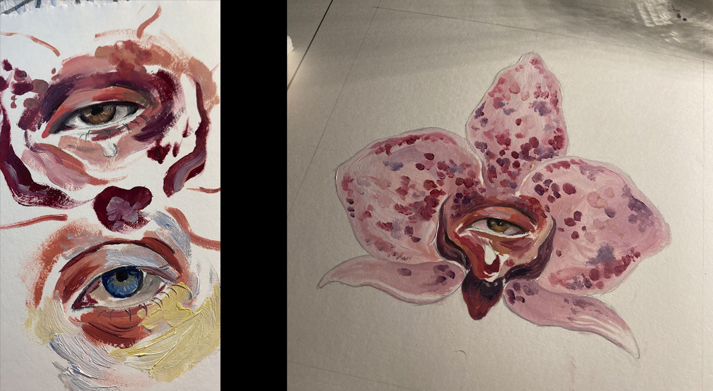
I worked with this asset to assemble the vinyl. Using the tandem of typefaces and sketched versions of the flower, I built the sleeve and record label that went into production, ensuring a unified identity across. You can check out the result above!
He collaborated with Tenerife‑based painter Alba Dorta to create a realistic orchid (Orquídea en español) for the cover.
Applications
During the album roll out we prepared a series of assets for the singles that came out. The letters were used in the mvs, as well as on socials to promote them.
You can check the music video for Nunca Sale Bien, or alternatively watch the lyric video (entirely using the bespoke fonts) for Vestida de Azul.
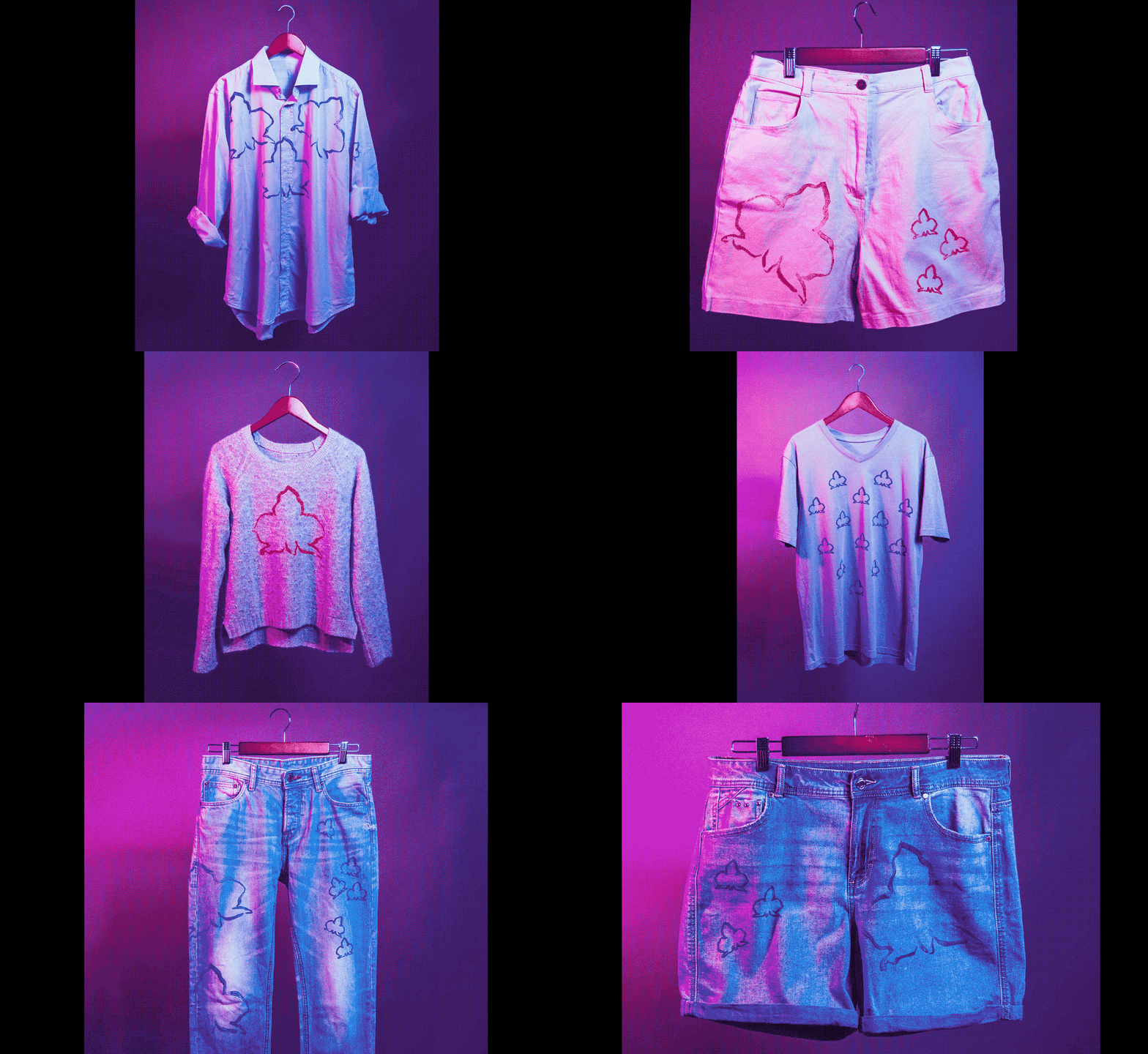
Additionally, together with Tenerife fashion designer Ventura, we created a line of upcycled merch that could be purchased live.
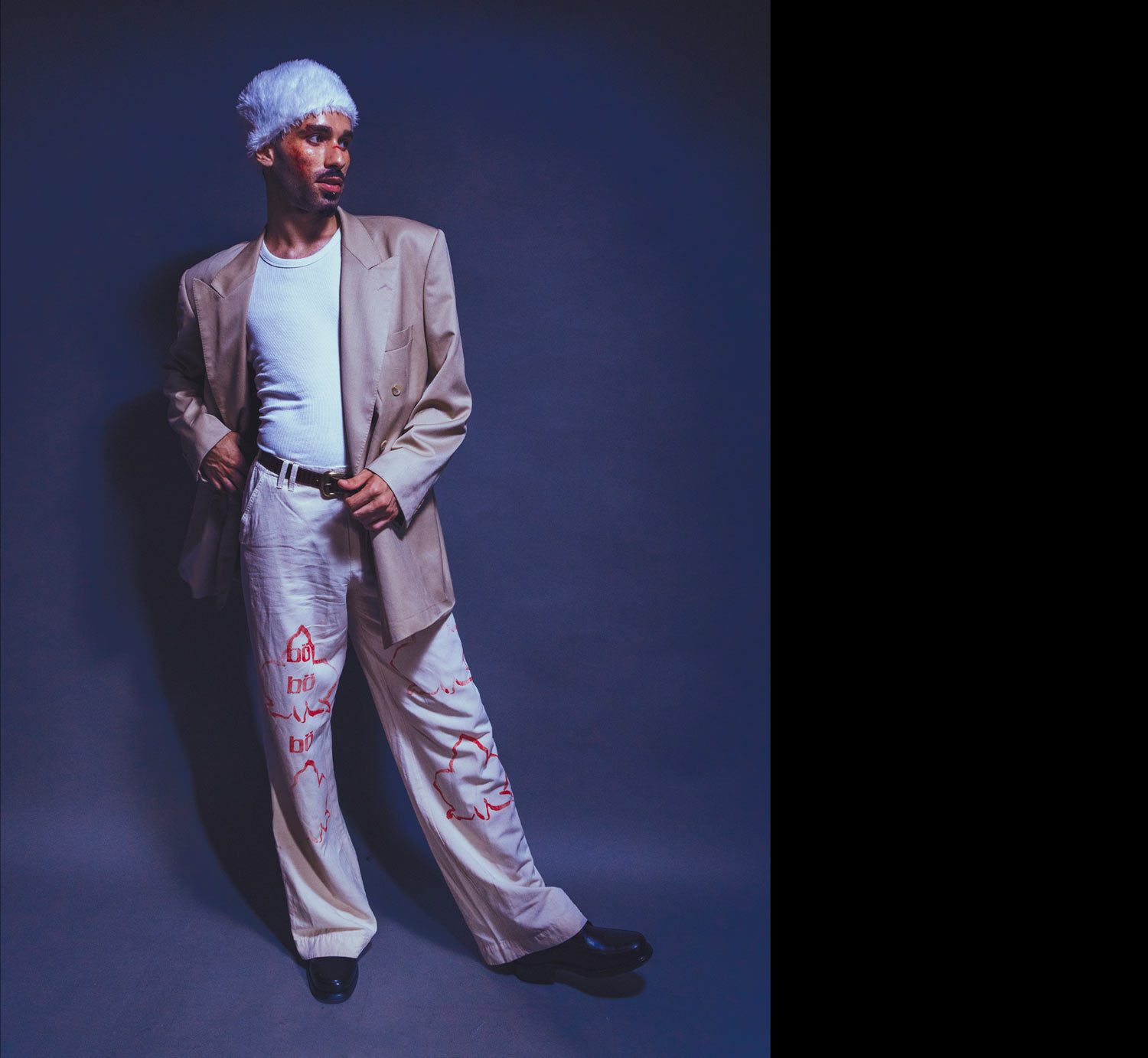
And alternatively, also at the concerts, we also prepared a stamping system to label your own clothes with Orquidea patterns.
You can listen to Orquídea on Eric Böelle's Apple Music and Spotify!
