In the summer of 2021, a new project quietly started forming the bedrooms of a few friends from Tenerife. Paula de Vega, a friend I’ve admired for years, began rehearsing with bassist Víctor Garritano, guitarist Pedro Rodríguez, and drummer Miguel Suárez to potentially start a new band.
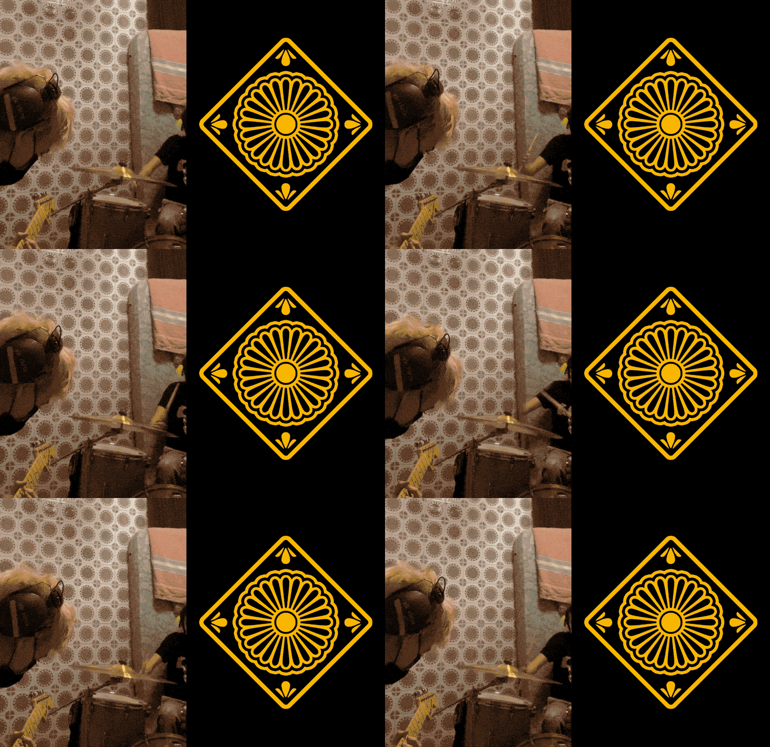
They called themselves Baldosa (Spanish for "tile") a name born half-jokingly during a rehearsal at Miguel’s place, where the wall was covered in old ceramic tiles. The name stuck, grounding the band in a kind of domestic nostalgia that matched their sound.
One of the first assets we created was actually a baldosa, a tile inspired by the pattern of that room of rehearsals.
Since the beginning, I’ve been in lucky enough to art direct their visual world. For this reason, Baldosa has never feel like a client, but more as a playground where we could try new things to accompany their sound.
On this article, I describe our first year collaborating, in which Baldosa released their debut self-titled EP. The music, although bright and playful, is filled with lyrics that ache with nostalgia. Designing for them meant balancing that contrast.
Album covers
I was there for some of their first rehearsals, often with a notebook in hand, sketching while they played. Their logo was born during these sessions in Paula's flat, which draws from art nouveau and vernacular bar lettering.
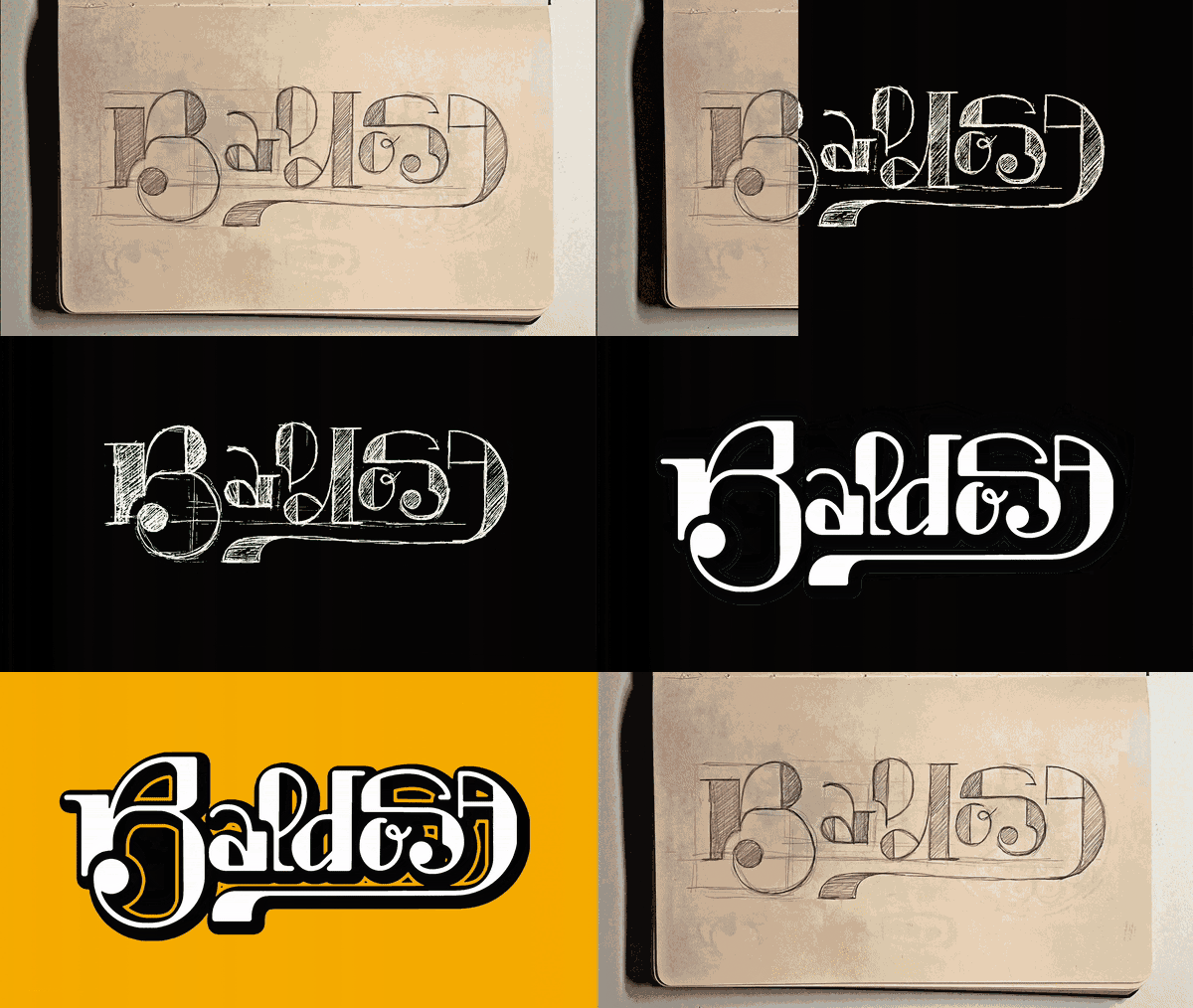
Before the band went public, Paula and I started thinking of the visual direction the band could adopt. The visuals had to feel fresh, but also slightly worn-in. Baldosa is a modern (and feminist) band with older (and not so feminist) references.
We decided to create an identity that felt deeply Spanish with a fresh twist. For this, we decided to play with the idea of the Spanish sobremesa, the chatty period after finishing a meal. Embroidered napkins, Duralex glasses and wine-stained glass tables were visual anchors for the identity, together with stereotypically Spanish foods: Tortilla, fabada, olives and red wine.
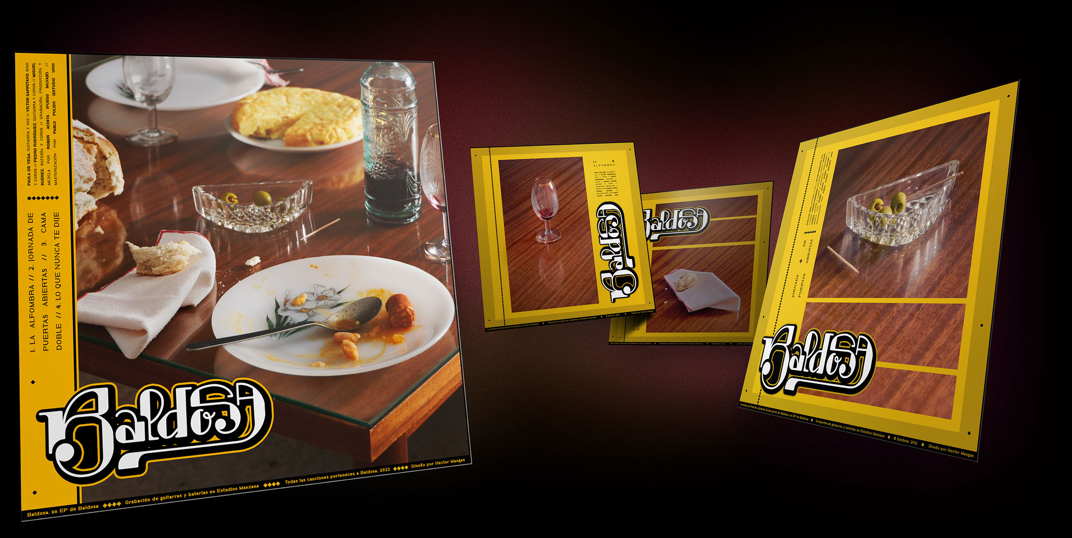
The cover art features a still life of a sobremesa, but only one of the plates has been touched. The other remains empty. Plate, cutlery and napkin are set but untouched, as if the second guest never showed up. We can almost hear the silence, that heavy kind when you're left alone at the table.
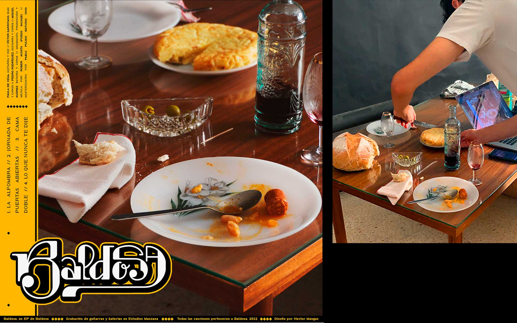
During one studio session we shot all the covers together: The full still life for the EP, and three separate elements for the singles (you can see them at the top of this page). I art directed and photographed the shoot, and the band brought tortilla, fabada, and most importantly, wine.
Color became central in this phase. Although we initially considered blue tones, during this photo shoot, yellow quickly emerged as the color that combined best with the cover's warmth.
Hello, Baldosa
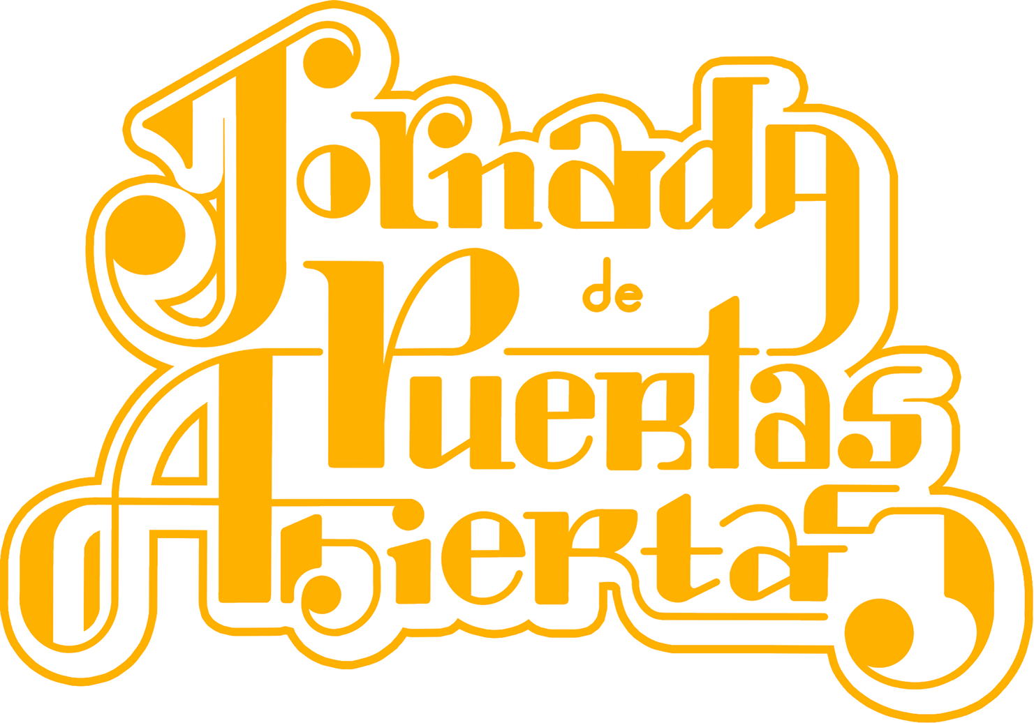
Their first single, Jornada de Puertas Abiertas, was released alongside a music video directed by Rut Angielina. I created several visual assets for the video — playful, slow-moving elements that matched the song’s warm and slightly surreal atmosphere. You can watch the video on YouTube.
Fun fair!
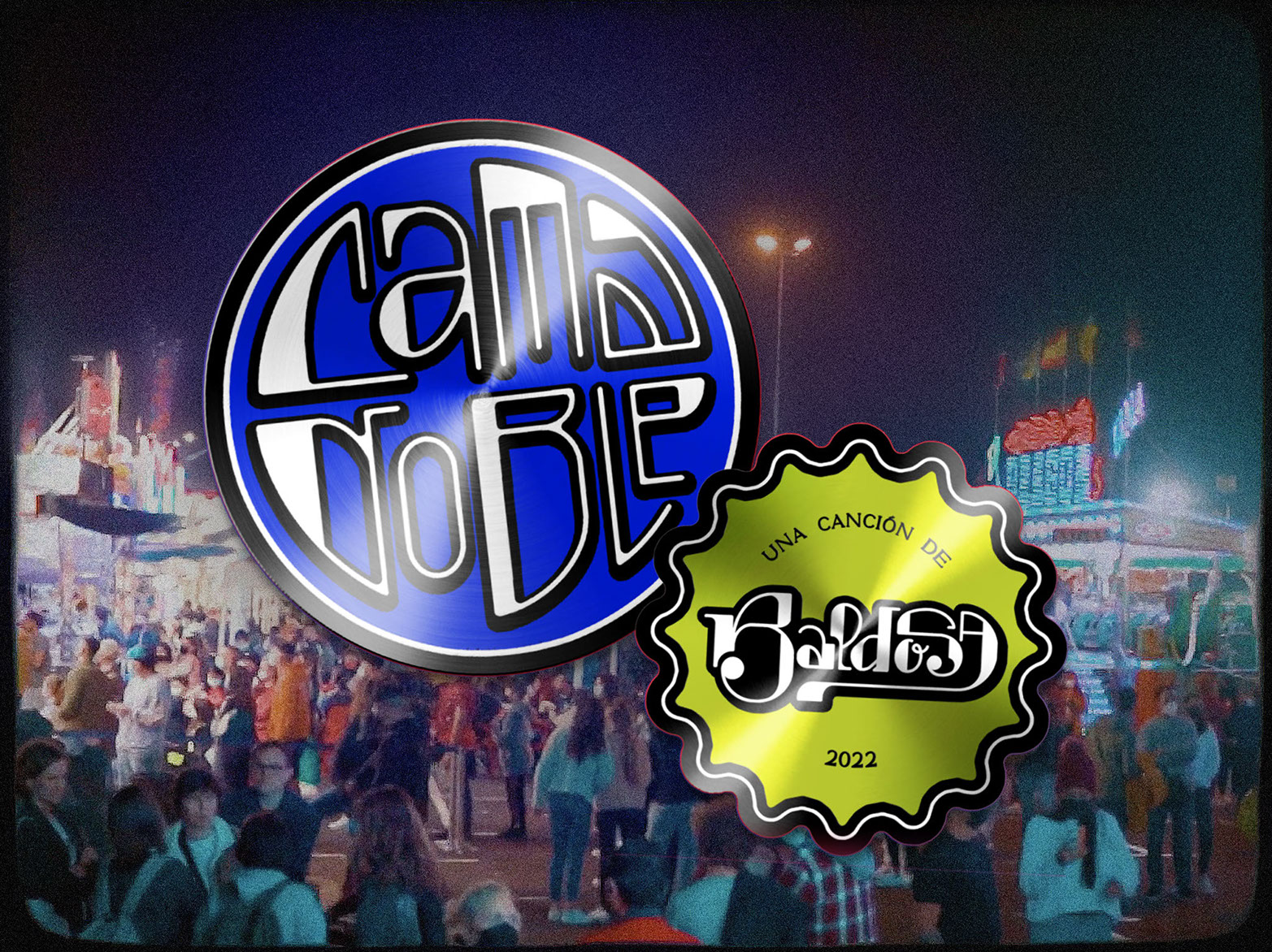
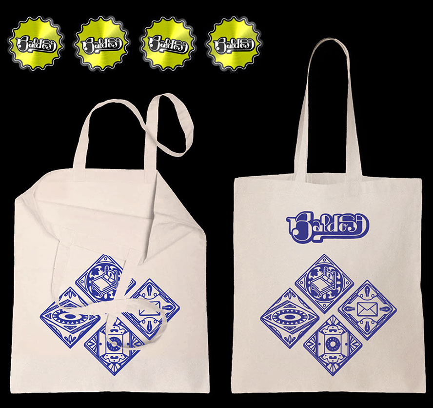
For their second single, Cama Doble, the video was shot in a fun fair by Polaris Estudio. This one called for more gloss: visuals inspired by the playful aesthetic of collectible sticker albums and toy labels. I designed and animated a full sticker set that lived across the music video, the band’s social media, and eventually, their merch. Seeing these printed and sold as real stickers was a highlight of this project.
Cozy letters
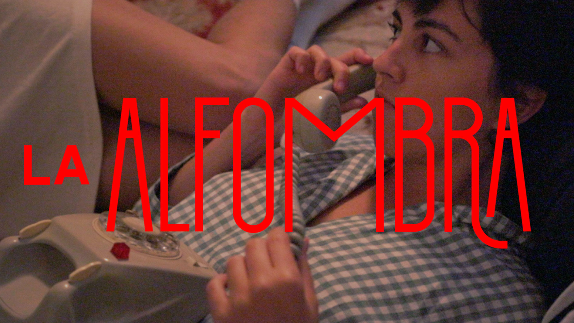
Their third single came with another video by Polaris Estudio, this time edited by me. To accompany it, we produced a simple lyric video in square format, where each line of the song unfolded in a bespoke lettering system designed by yours truly. The warm aesthetic of the video contrasts with the deep sense of dread Paula et al. put into this one. You can watch the music video here.
Animated lyric video
Lastly, the day of the release, a lyric video for the last song in the project came out with it. The video was a simple animation using the aesthetics of the era, with a lot of yellow, and a lot of tiles. You can watch the video on YouTube here.
Applications
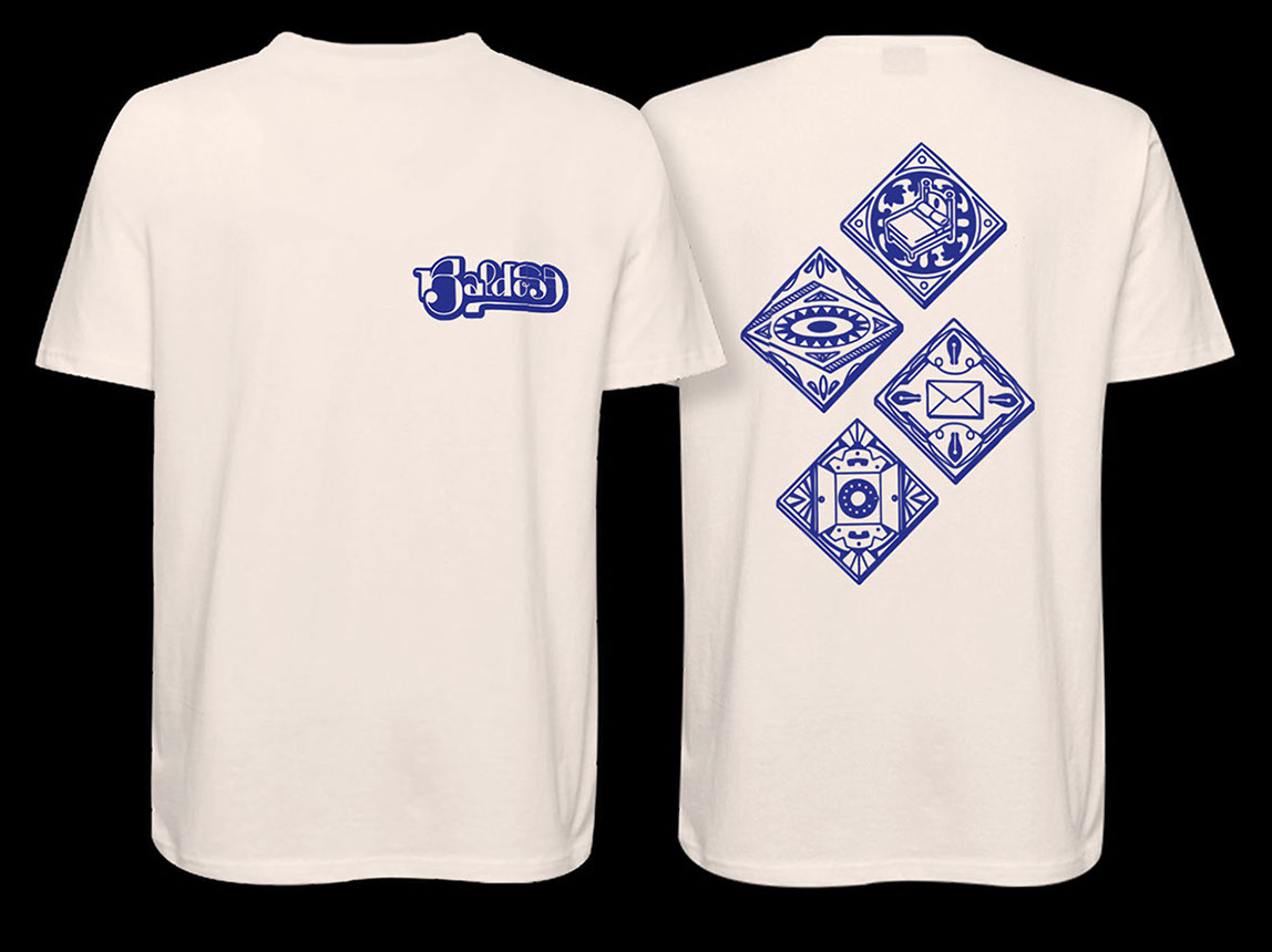
Beyond the screen, Baldosa's first EP spilled into a limited edition of t-shirts, tote bags, and stickers. The merch designed for this era features four tiles, one for each song, arranged like pieces on a kitchen wall.
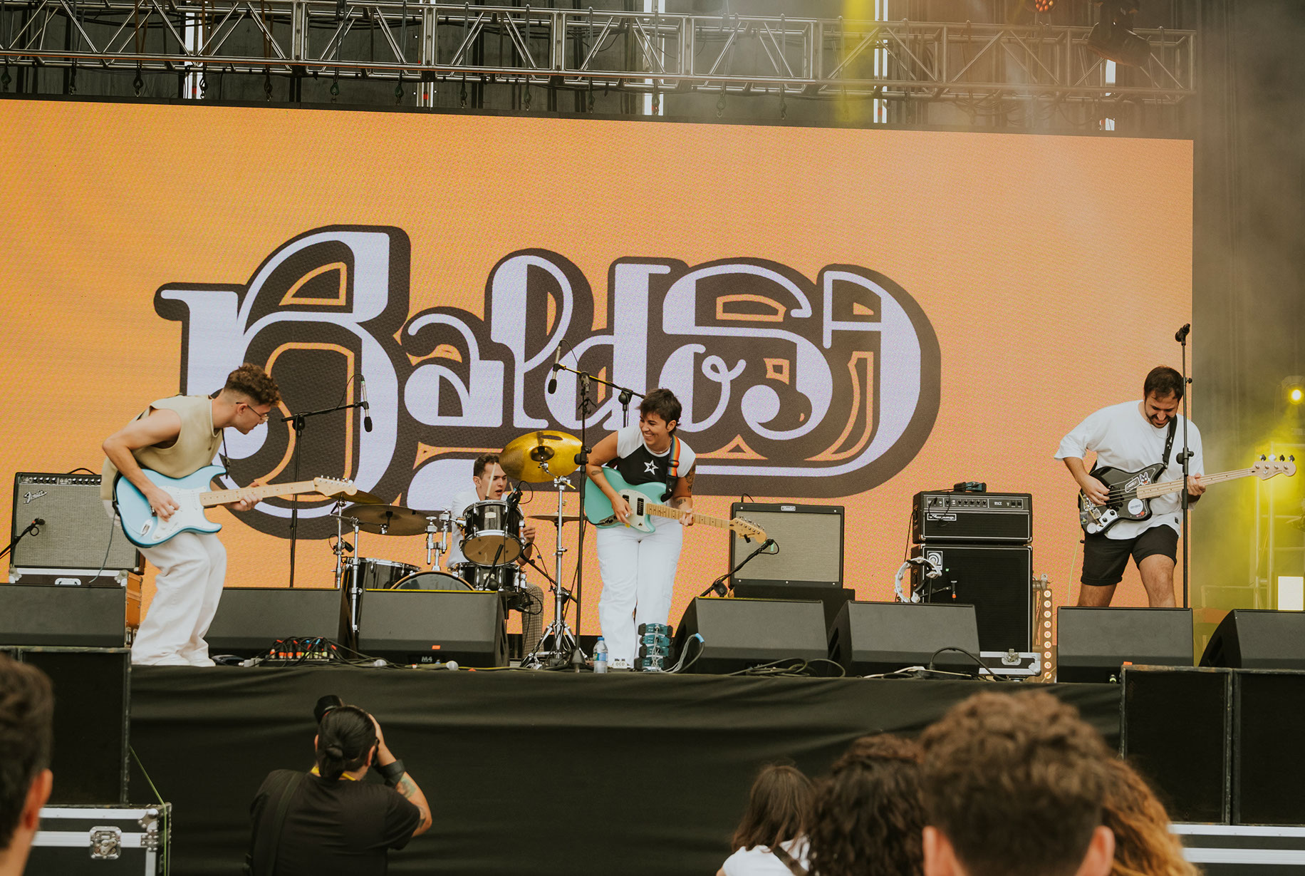
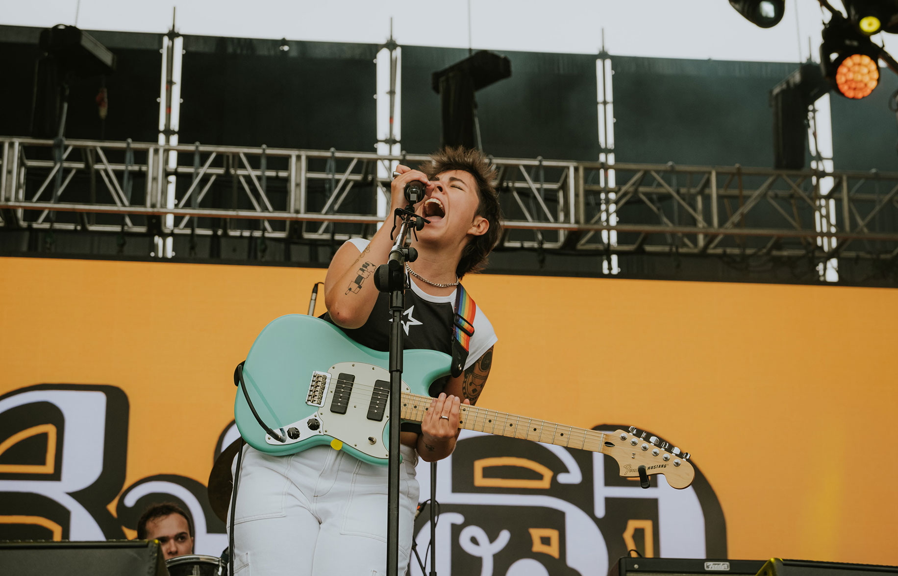
Additionally, for their live performance I developed background visuals. Loops and static images to reinforce the band's aesthetic in their own gigs and the festivals they play in.